
We’ve painted Nienna, the Elf Ranger, who is a great PC figure. Now she just needs someone to fight, so I picked up these guys:
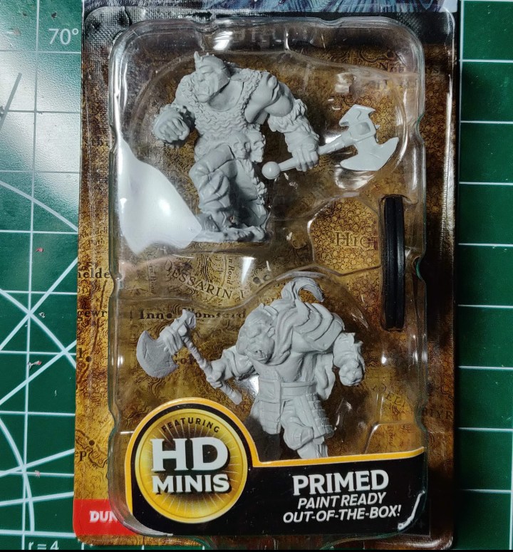
These are Orcs from WizKids’ Nolzur’s Marvelous Miniatures line. Overall, I really like these guys. They’ve got a lot of personality, and the detail is excellent (especially the chainmail on the helmeted one). One odd detail that stands out (but is still kinda fun) are the shoes on the one with the ponytail; he looks like he’s wearing suede chukka boots, which is a very dad-like style choice. If you decide to use him as an Orc Dad PC, please let me know how that played out in the comments.
This one had some flash lines and a few places where the primer dried a little rough, so he did require some cleaning, but not much. He should be easy to prep regardless of your skill level.


And here he is, prepped and primed. I did have to go back over and touch up the primer coat, since removing the flash and cleaning up the primer where it pooled and bubbled stripped a bit of it off, but this is not always necessary with these minis. I used the Grey Primer from the D&D Adventurer’s Paint Set to even everything out. In fact, most of the paint I use on this one is from the Adventurer’s set.


Basecoating him was simple. Orcs like bright, bold colors, so I used Dragonfire Red for his cape and Treant Green for his pants. His belt, boots, and bracers are Bugbear Brown, and his armor is Mithral Silver. I used Abyssal Black for his hair, and finished the gold highlights with Vallejo’s Glorious Gold. I mixed a tiny bit of Angelic Yellow with Lawful White for the tusks, and left the primer coat for the flesh tone. This is a trick that can help you save a lot of time when painting figures, especially for wargaming, and it’s one that companies are starting to support more now. Using a primer that’s the same color as your basecoat finishes two steps in one, and cuts the time down immensely. Army Painter’s technique depends heavily on priming your figure(s) in the dominant color (like this can of Greenskin Flesh for 40k Orks, f’r’example), and offer a good range of spray primers that match their bottle colors exactly. If I had to paint a warband of these guys quickly, the grey primer would help considerably, even though I’m used to priming in black.
Because I am using grey instead of black, one thing I’ll need to keep in mind is the color will need to extend to the edges of whatever part of the model I’m painting instead of stopping right before it and letting the black undercoat provide a border or other negative space. The wash will help pick out some of that detail anyway, so it’s not a huge setback. If you don’t bring the color right to the edge you’ll get odd gaps of grey, which will not look nearly as natural as black would in the same area.
Speaking of the wash, we’re going to do something a little different with this one.


If you read the post where we painted Nienna, you’ll remember we used one wash for the entire figure. While this is perfectly acceptable practice for many different models (and, indeed, dipping figures in a wash is a tried and true method for speed painting armies going back years), there are times when you may want to have more control over the colors you use to provide depth to your figures. For this one, I’ve matched the colors of the washes more specifically to the colors they’re shading. Above, you can see where I’ve applied Army Painter’s Red Tone to the cape.


Here, I’ve put AP’s Green Tone on the pants, and Mid Brown on the shoes, bracers, and belt. Brown washes work great on golds, and black washes work very well on silvers and gunmetals, but there is always room to play around and experiment. If you want an aged or neglected look to steel, a brown or even a flesh wash can add incredible depth and character to a model. I’ve used corresponding colors here, but imagine what you could do with colors that are a shade or two different, like a purple wash on a pink Mind Flayer, or a green wash over an undead grey skintone. Don’t be afraid to play around with things and see what works; many of my favorite effects I’ve stumbled on just by seeing how it looks when I try something.


Here I’ve finished off the washes with AP’s Dark Tone on the skin and Secret Weapon’s Armor Wash on the metal. This is where the model really starts coming together, as both of these washes really pick out the detail. Also, notice how the Armor Wash has a slight brown tint to it, making the plates look clean, but not especially cared for. If we were painting a hobgoblin, we might have gone with a blacker wash (like Nuln Oil) to give it a cleaner finish, as the black will look less like rust or dirt than what we’ve got here. If you’re pressed for time, you could call it done right now and the figure will look great on the table. We’re going to keep going with this one, though, and show you how picking out the highlights will take it to the next level.


After all the washes have dried, I’m ready to hit the highlights. Here, I’ve taken the Dragonfire Red and Treant Green and applied it to the raised parts of the cape and pants. It’s subtle (and not terribly easy to see in the photo), but even this will make these areas stand out against the darker folds where the wash has settled. If you’re painting a lot of figures, again, you’d be well within your rights to stop here and call it done. Dozens of figures painted to this level will look just fine from three feet away, since in wargaming, a lot of figures painted to one level of highlighting can be as impressive as one figure with highlights taken up three, four, or more levels. But we’re going to keep on just a bit further.


Here I’ve added a bit of yellow to both the red and the green and applied it in very narrow bands to the highest parts of the corresponding colors. I’ve left the previous highlights still visible around the edges, so from a distance, the colors will blend smoothly from dark in the recesses to light on the highest points. I’ve used yellow because white would wash the colors out, especially the red, making it more pink. This sounds counterintuitive, but generally you want to highlight reds with yellows and oranges instead of white. Greens generally look best when highlighted with yellows as well. It’ll make the color more vibrant, and, as you can see in the photos, will really help make the figure pop.


Here I’ve hit the armor with Mithral Silver, and the flesh with Vallejo’s Cold Grey. I only took these up one level, since I wanted the cape and pants to be the focal point (and there’s not much room to go anywhere from the silver I used), and I didn’t want to overwork the flesh tone. I used the Vallejo grey on the hair as well, to give it an illusion of shine, and then hit the shoes and bracers with a bit of the Bugbear Brown


Finally, I painted the base with Stirland Battlemire for texture, and for fun, I added some Blood for the Blood God technical paint to the edge of the axe. Hope whoever that blood belongs to doesn’t have friends who’ll come looking for payback!


Overall, this guy was a lot of fun to paint, and ended up looking great when I put him on the terrain backdrop. Like Nienna, he’s not going to win any painting contests, but that’s not the point. We’re not painting to stress ourselves out or push ourselves relentlessly to achieve unachievable perfection. We’re painting to have fun, and to get a lot of figures that look great on the table, even if they’re just okay.
Happy painting!

One thought on “FOR THE HORDE!”